Exploratory Graphics
Knowing that I was only working with only the prepared portion of my data, I wanted to best understand what might be discerned from only a limited subset of knowledge. My larger project is intended to take a very different approach to the subject of non-native species and boreal disturbances, but there is still some flexibility in what is ready to be analyzed.
Here I have shared a sample of my exploratory graphics produced in RStudio, including descriptions of what I was intending to explore through these outputs.
|
My first thought was whether or not species richness (a count of unique species at a given site) would be strongly influenced by the different treatments. I wanted to start very broadly, at the landscape scale, without a focus on the individual plot level measurements. When producing the graphic in Figure 1, I included all species, regardless of if they were considered native or non-native. Richness does not appear to vary strongly across the different treatments, although the variance in burned forests was much higher than the rest. This preliminary result indicated to me that perhaps overall richness would not be a strong indicator of the boreal's response to disturbances.
|
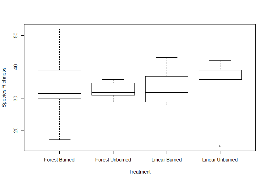
Figure 1. Boxplots showing total species richness as a metric of treatment type.
|
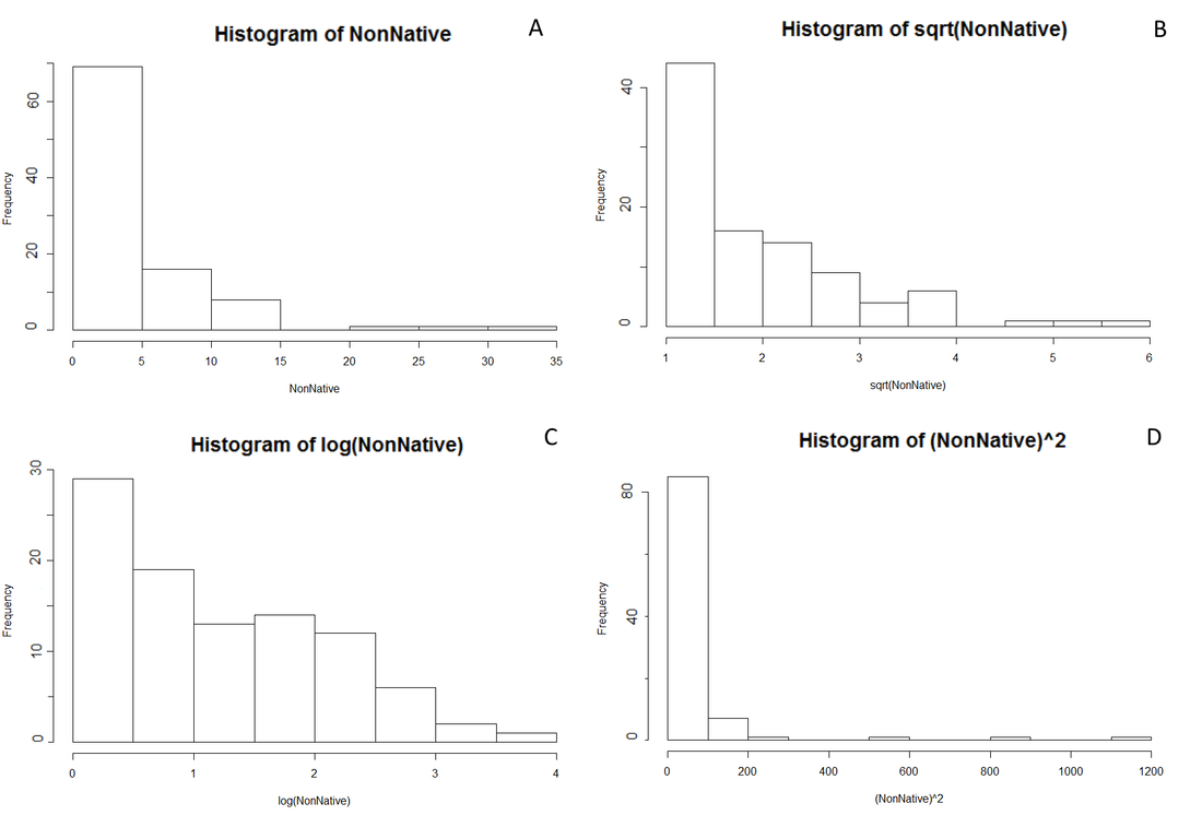
Figure 2. Histogram outputs were generated in RStudio to explore the normality of percent covers for native and non-native species. Here, only non-native species are shown, although the native outputs looked incredibly similar. (A) Untransformed data (B) squareroot transformation (C) log transformation (D) squared transformation. All four transformations remained strongly non-normal for both native and non-native species.
|
After seeing richness by itself may not be a strong measure of species compositions, then I could instead look at a weighted measure, such as average percent covers. Percent cover histograms of the species found are extremely non-normally distributed. Even through a series of transformations, the data would have a very distinct skew. This was true for both "native" and "non-native" species (although only non-native is explored in Figure 2). For my final analysis, I instead found that handling the data as a proportion told a much clearer story. Since any given plot can be equal to less than, or greater than 100% (due to bare ground, or overlapping species) a proportion of what is resent better represents how the species composition changes from one plot to the next. While the questions being asked by this study are not directly concerned with native species, rooting the analysis in a proportion more clearly represents how the dynamic between the two groupings may be changing.
|
|
The next step was to gain a sense of how percent covers within spatial plots varied. An important part of the study will be seeing how percent covers of non-native species are affected by their distance along a transect. Before I could explore that specific interaction, I first wanted to know if percent covers were naturally influenced by distance along a given line, regardless of species or treatment. Figure 3 shows the expected result, that individual species largely exist in small percent covers, with only a handful of species occupying a range of >20% cover. The distance along a line does not appear to naturally promote large abundances of singular species, suggesting that looking at average percent covers spatially should not favor any species or plot.
|
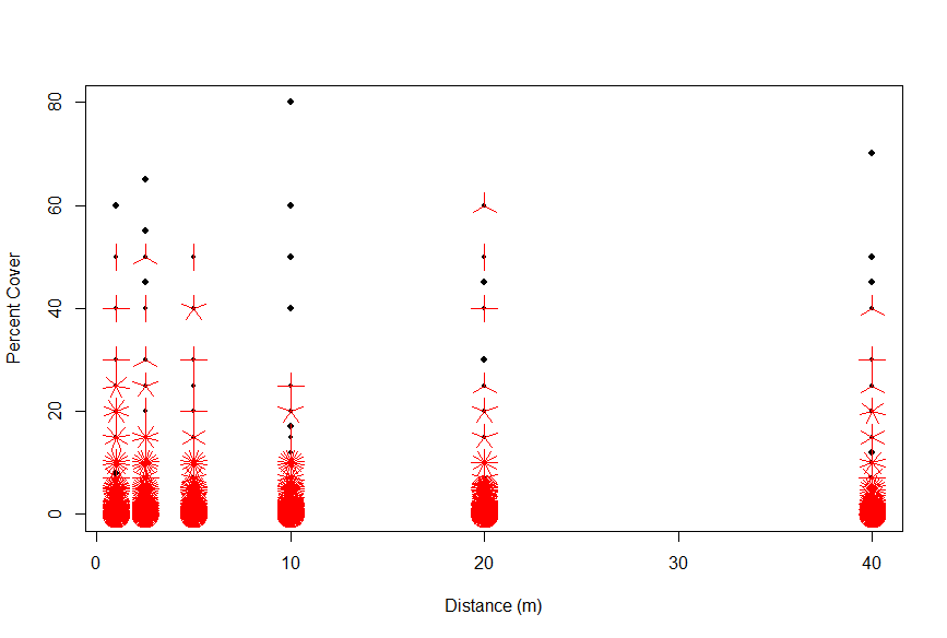
Figure 3. Sunflower plot used to show the concentration of percent covers for individual species across out transect measurements of 1, 2.5, 5, 10, 20, and 40m.
|
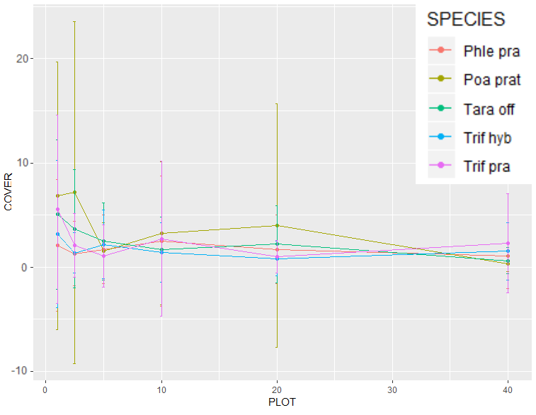
Figure 4. The average percent covers of only the 5 most abundant non-native species found, as measured along transects. Phle Pra (Phleum pratense), Poa prat (Poa pratensis), Tara off (Taraxacum officinale), Trif hyb (Trifolium hybridum), and Trif pra (Triofolium pratense).
|
Out of a total pool of 143 species recorded, 24 of them were categorized as being "non-native", with many of them only rarely occurring. Through Figure 4, I wanted to explore the most prevalent non-native species. When ranked by both frequency (unique sites) and total percent covers, the top 5 species were Phleum pratense, Poa pratensis, Taraxacum officinale, Trifolium hybridum, and Triofolium pratense. As a generalization, all of the species would trend towards lower perfect covers the further down the transect measured. As can be seen in Figure 4, the data had such broad variability, with many counts of 0, and error bars so long that they illogically reached into negative values, that it was unlikely that I would be able to draw any effective conclusions at the species level.
|
Through the simple exploratory graphics above, we can see that overall species richness itself is not a function of the given treatment types, that average percent cover tells an incomplete story, that distance within a forest does not naturally promote larger abundances of individual species, and that there is not enough data to focus on a micro-scale of specific species.
Given these broad indicators, I was able to plan an approach to analyzing my data that would best explain the true forest compositions. The species makeup of the landscape must be addressed as a whole, and that turning these values into proportions would account for inconsistencies in plot level data.
Given these broad indicators, I was able to plan an approach to analyzing my data that would best explain the true forest compositions. The species makeup of the landscape must be addressed as a whole, and that turning these values into proportions would account for inconsistencies in plot level data.
